Introduction
If you’ve been flirting with the idea of passive income, you’ve probably also noticed the same annoying pattern I have: the stuff that actually sells is rarely the stuff people call “easy.” Digital planner templates are a perfect example. The upside is real (scalable, instant delivery, global buyers, no inventory). The catch is you earn the “passive” part by front-loading the work: you design a system people genuinely want to use, you package it cleanly, you market it like you mean it, and then you let distribution do its thing.
So yes, you can create and sell digital planner templates for passive income by building a niche-specific planner (made for iPad and GoodNotes first), exporting it as a properly hyperlinked PDF, bundling it with matching sticker sets, and selling through Etsy, Gumroad, and your own site with platform-specific SEO and content marketing that doesn’t feel like it was written by a vending machine.
Meta description: Learn how to create and sell a digital planner template for passive income, with GoodNotes-first layouts, hyperlinked PDF export settings, matching sticker upsells, Etsy SEO, Pinterest strategy, and realistic earnings scenarios.
Why tablet planning keeps growing
iPad and GoodNotes demand signals
The growth isn’t subtle. It’s right there in the way people treat an iPad like a notebook that never runs out of pages, never gets coffee spilled on it, and can still hold ten years of life admin without turning into a paper brick. GoodNotes and Notability didn’t “replace” paper planning, they turned planning into an app ecosystem with its own micro-economy: templates, covers, sticker books, brush packs, handwriting fonts, tutorial videos, “Plan With Me” streams.
Market research firms even try to put a neat number on the whole thing. The figures in this digital planners market report peg serious growth ahead, and whether the exact dollar value is perfect or not, the direction is the story: more tablets, more stylus users, more people wanting a setup that feels custom.
Productivity culture and creator economics
People don’t buy planner pages. They buy a feeling: control, momentum, less chaos. A planner is basically a dashboard for being a human. And because “productivity culture” is now a content genre, you get this flywheel: Pinterest pins lead to Etsy searches, Etsy searches lead to YouTube walkthroughs, walkthroughs lead to “I need that exact layout” purchases.
Etsy is the big noisy mall here. There are supposedly over 95 million active buyers floating around that platform, which is why beginners pile in even if they swear they hate marketplaces. If you want a grounding dose of scale, this breakdown on Etsy’s audience size is the kind of thing that sobers you up in a useful way.
What “passive income” really means here
A digital planner business is passive the way a rental property is passive. You still had to buy the thing, fix the thing, list the thing, and answer messages from someone who swears they “didn’t receive” the download because they checked their email spam folder with their eyes closed.
Expect work up front in three places:
- The product has to be good enough that refunds are rare and reviews are boringly positive.
- The listing has to be understandable, with instructions that prevent support tickets.
- The marketing has to keep running after your launch week dopamine wears off.
Do that, and you can absolutely get to a point where you wake up, check notifications, and see sales from three time zones you weren’t even thinking about.
Choose a niche and product scope
Audience-first angles that sell
The fastest way to waste a weekend is to build a generic “everything planner” and assume the world will applaud. Nobody is searching for “everything.” They’re searching for their problem. University semester chaos. Pregnancy appointments. Debt payoff. Meal planning with macros. Content calendar plus client onboarding.
I like niche planning because it forces design discipline. You stop decorating blank boxes and start building workflows. The planner becomes a route, not a vibe.
And if you’re worried a niche is “too small,” remember: niche audiences tend to buy more than one product, because they want a matching set, a backup version, a sticker kit, a bundle for next year.
Category checklist for strong demand
If you’re deciding what to build first, I’d look for categories where people track repeating data and feel guilty when they don’t. That guilt is demand in a trench coat. Here are planner categories that consistently move, especially when positioned as an iPad planner template built for GoodNotes templates and quick navigation:
- Daily and weekly planners (time blocking, routines, to-do systems)
- Monthly and yearly planners (goal review, annual overview, projects)
- Academic planners (school year, semester, lecture schedule, assignment tracker)
- Fitness and wellness planners (workout logs, meal planners, water trackers, sleep)
- Financial planners (budget tracker, savings goals, debt payoff)
- Business planners (content calendar, project tracker, client management)
- Specialty planners (wedding, gratitude journal, travel itinerary, habit change, pregnancy)
You’ll notice “travel” isn’t fluff. People love a clean itinerary view that works offline on a flight, with hotel reservations, a loose schedule, and a packing checklist that doesn’t require cell service in some random destination.
Validation methods before you design
Before you touch Canva or Keynote, do ten minutes of market listening. On Etsy, type your niche phrase and let autocomplete show you what buyers already search. Open the top listings and read reviews like you’re stealing product intelligence (because you are). People will tell you what they love and what broke.
If you want to be extra about it, Etsy has an official guide to using their own Marketplace Insights tool. It’s not magic, but it’s a start.
Then validate outside Etsy, because Etsy can become an echo chamber. Pinterest search suggestions are weirdly honest. YouTube comments are even more honest, sometimes in a way that makes you want to lie down for a minute.
Pick the right planner format
Dated, undated, and reusable systems
Dated planners sell on urgency. Undated planners sell on flexibility. Reusable systems sell on identity. The right choice depends on who you’re targeting and how you plan to update.
If you’re aiming at students, a dated academic year planner (Aug to May, or Sep to Jun globally) makes sense and creates annual repeat purchases. If you’re aiming at habit change or wellness, undated is safer because nobody wants to “start over” because they missed March.
A hyperlinked PDF planner can be any of these, but dated planners need more QA. One wrong link and you’ll get a message that reads like a threat.
Page counts that feel “worth it”
Page count is psychological pricing. People love seeing “300+ pages” even if they use 40. The trick is not bloating the file into lag on older iPads.
A reasonable sweet spot for a first product: 80 to 180 pages, with duplication baked in (like a weekly spread repeated 52 times). If you go massive, keep the design light: fewer huge images, fewer layered textures, more vector shapes.
Bundles that fit real workflows
Bundles are where your revenue starts acting like a grown-up. A single planner is a single decision. A bundle is “fine, I’m set.”
You can bundle by time (daily + weekly + monthly), by theme (finance + meal planning), or by role (student pack, new parent pack, entrepreneur pack). You can even bundle “lite” and “max” versions for different personalities: minimal folks hate decorative pages, maximal folks collect sticker books like they’re trading cards.
Build the layout and navigation
Page size and orientation standards
Most buyers won’t ask for measurements, but they’ll feel it when your page is awkward on screen. Common standards that behave well:
US Letter portrait: 8.5 x 11 inches. Great for readability, a little “big” on smaller iPads.
Half Letter portrait: 5.5 x 8.5 inches. Cozy, very popular for tablet planning.
Landscape versions work nicely for weekly spreads and dashboards.
If you’re designing for GoodNotes, remember the user is zooming, writing with a stylus, tapping tabs. Thin margins are cute until someone’s handwriting hits the edge and they hate you.
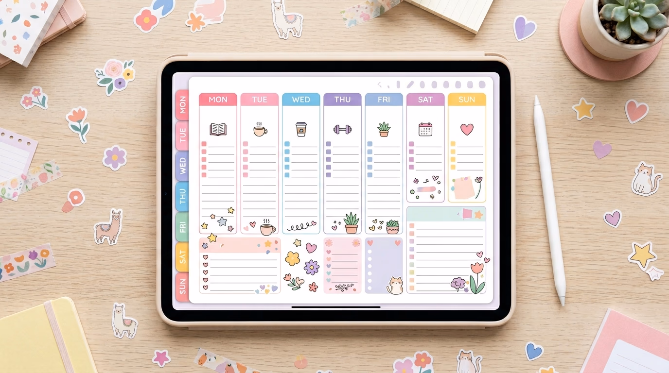
Tabs, index pages, and deep links
Navigation is the difference between “pretty PDF” and actual digital planner utility. Tabs are your home screen buttons. Index pages are your map. Deep links are the teleportation system.
Build a home page that links to monthly views, weekly sections, trackers, notes, and any specialty pages. Then build a year index (12 months) and a month index (weeks, trackers, notes). People want to jump around like they’re switching apps.
Keep your tabs consistent in placement. Your brain learns where “Budget” lives, and if you move it on half the pages, you’ve created a tiny daily irritation. Irritations become refunds.
Usability tests in GoodNotes
You’re not done when the PDF exports. You’re done when it works on an iPad inside GoodNotes the way a normal person uses it: one hand, distracted, maybe on a couch, maybe on a flight with weird lighting.
My quick test routine is simple: import the file, tap every tab, scribble on a few pages, duplicate a week, add a sticker, undo, export a page, re-import it, then check if links still behave. If something feels slow, it will feel slower to a buyer with a stuffed app library and 2,000 notebook pages.
Design and export the files
Tool comparison: Canva, Keynote, PowerPoint, Affinity, InDesign
People argue about tools like they argue about gym routines. The best tool is the one you’ll actually use consistently without rage-quitting.
Here’s the honest comparison:
| Tool | Best for | Hyperlinks | Learning curve | Notes |
|---|---|---|---|---|
| Canva | Fast design, pretty layouts, social graphics | Yes (limitations) | Low | Great for covers, pages, sticker elements; be careful with precise link mapping |
| Apple Keynote | GoodNotes-first planners, clickable tabs | Yes | Medium | Shockingly good for building a hyperlinked PDF planner quickly |
| PowerPoint | Windows-friendly Keynote alternative | Yes | Medium | Solid for layout grids and link management, especially for corporate-looking planners |
| Affinity Publisher | Pro layout, multi-page management | Yes | Medium-high | Strong alternative to Adobe; good for designers who want control |
| Adobe InDesign | Heavy-duty publishing workflows | Yes | High | Best for massive planners and precise typography, but subscription costs sting |
If you’re a designer, InDesign or Affinity Publisher will feel like home. If you’re a creator who wants speed and ease without becoming a “layout person” overnight, Keynote is criminally underrated.
Hyperlinked PDF export settings that work
Hyperlinks fail because of export settings, not because the universe hates you (though it might). The goal is a PDF with internal links preserved, file size reasonable, and pages crisp enough for handwriting zoom.
In Keynote and PowerPoint, make sure you’re exporting as PDF with hyperlinks included. In Affinity Publisher and InDesign, ensure the hyperlink panel is used properly and export with interactive elements enabled.
A few practical realities:
- Flatten overly complex transparent layers. They balloon file size and can make scrolling feel like dragging a pool float through molasses.
- Stick to readable fonts. Handwriting apps already add visual noise.
- Test on-device. Desktop preview is a liar.
File delivery, instructions, and version control
Selling digital products is half product, half customer success. Your listing needs a clean download package: the PDF, a folder of PNG stickers if included, and a one-page “How to import to GoodNotes” guide with screenshots.
Version control matters more than people admit. If you update a planner, label it clearly (v1, v1.1) and keep a changelog. Buyers will message you months later from an old account and swear you “changed the file.” Sometimes they’re right.
Sell and market across platforms
Etsy is where most people start because buyers are already there searching, which is why “digital planner Etsy” remains a real demand phrase. Gumroad is where creators go when they want a simpler storefront and a direct relationship. Your own website is where you go when you want control, email capture, and fewer platform mood swings.
Etsy has fees. They’re not mysterious, but they are irritating. A decent overview of Etsy’s fee structure, including the standard transaction fee, shows up in places like this Statista Etsy topic page, and the classic $0.20 listing fee gets explained in plain English in guides like this one on selling digital planners on Etsy.
Pricing strategy is where people either get strategic or start undercharging because they’re nervous. You can price individual planners (good entry point), bundles (best value perception), or subscription access (harder to maintain, more predictable revenue). A lot of sellers land in the $8 to $25 range for a single planner, then $19 to $49 for bundles depending on page count, niche specificity, and whether stickers are included.
If you want a reality check that doesn’t sugarcoat, creators have publicly shared numbers in mainstream coverage, like this Business Insider story about someone earning significant revenue selling Etsy digital downloads. No, that’s not average. Yes, it proves the ceiling is higher than most people assume.
My favorite marketing stack for planners is the one that looks boring on purpose: Etsy SEO for purchase intent, Pinterest for discovery, YouTube for trust, Instagram Reels for “watch me use it” proof. The content doesn’t need to be cinematic. It needs to show the taps, the tabs, the handwriting, the stickers, the workflow.
If you only do one thing on Etsy, do this: title and tags that match real search language, plus photos that show navigation. Etsy even documents how to read your shop analytics through Etsy Stats, which is unglamorous and extremely useful.
And Pinterest, honestly, is still the quiet MVP for this niche. Vertical pins with “weekly spread preview,” “student semester setup,” “budget dashboard,” “pregnancy appointment tracker” can send traffic for months, which is the whole point of trying to sell digital planners without constantly launching.
Matching sticker sets as an upsell (the easy money you shouldn’t ignore)
If your planner is the highway, stickers are the roadside attractions. People love them because they make planning feel less like a chore and more like play, and they’re also ridiculously practical: icons for bills, classes, workouts, hydration, calls, flights, hotel check-in, meal prep.
The upsell is straightforward: sell the planner alone, sell the sticker set alone, sell a discounted bundle. Sticker books also make great freebie lead magnets if you’re building an email list off-platform.
Realistic earnings scenarios (no guru fog)
Passive income math gets dumb fast, so let’s keep it clean. Here’s what monthly revenue can look like before platform fees, assuming your conversion is decent and your listings are not invisible.
| Product lineup | Avg price | Monthly sales volume | Monthly gross |
|---|---|---|---|
| 1 planner | $12 | 30 | $360 |
| 3 planners + 2 sticker sets | $12 to $18 | 120 total | $1,600 to $2,000 |
| 8 planners + bundles | $15 to $39 | 300 total | $4,500 to $7,000 |
Those numbers are plausible, not promised. The swing factors are niche fit, listing quality, reviews, and whether your Pinterest and Etsy SEO actually match what people search.
FAQ
Do I need an iPad to make GoodNotes templates?
No. You can design on a laptop and test on an iPad later, but you do need real-device testing eventually. A planner that looks fine on desktop can feel clumsy in GoodNotes.
What file type should I sell?
For planners: PDF, specifically a hyperlinked PDF planner with internal navigation. For stickers: transparent PNG files, often bundled into a “sticker book” PDF too.
Can I build everything in Canva?
You can, especially simpler planners, but Canva hyperlinking can get fussy at scale. Many sellers design the visuals in Canva and assemble linking in Keynote or PowerPoint.
Should I start on Etsy or Gumroad?
If you want built-in buyer search, start on Etsy. If you already have an audience (Pinterest, TikTok, email list), Gumroad is a clean checkout. Many serious sellers do both.
How do I avoid refunds?
Boring answer: great instructions and realistic preview images. Show the tabs. Show how it looks in GoodNotes. Spell out what’s included, what app it’s for, and how downloads work.
Conclusion
If you want this to work, treat it like you’re building a tool, not posting art. A digital planner succeeds when it makes someone’s day feel less slippery, when the navigation is obvious, when the pages match the way they actually live. Build for the iPad and GoodNotes ecosystem first, because that’s where the demand is loudest, then widen out with formats, sticker packs, and bundles that feel like a complete system instead of random pages in a zip file.
The “passive” part comes later. The control part comes now.


